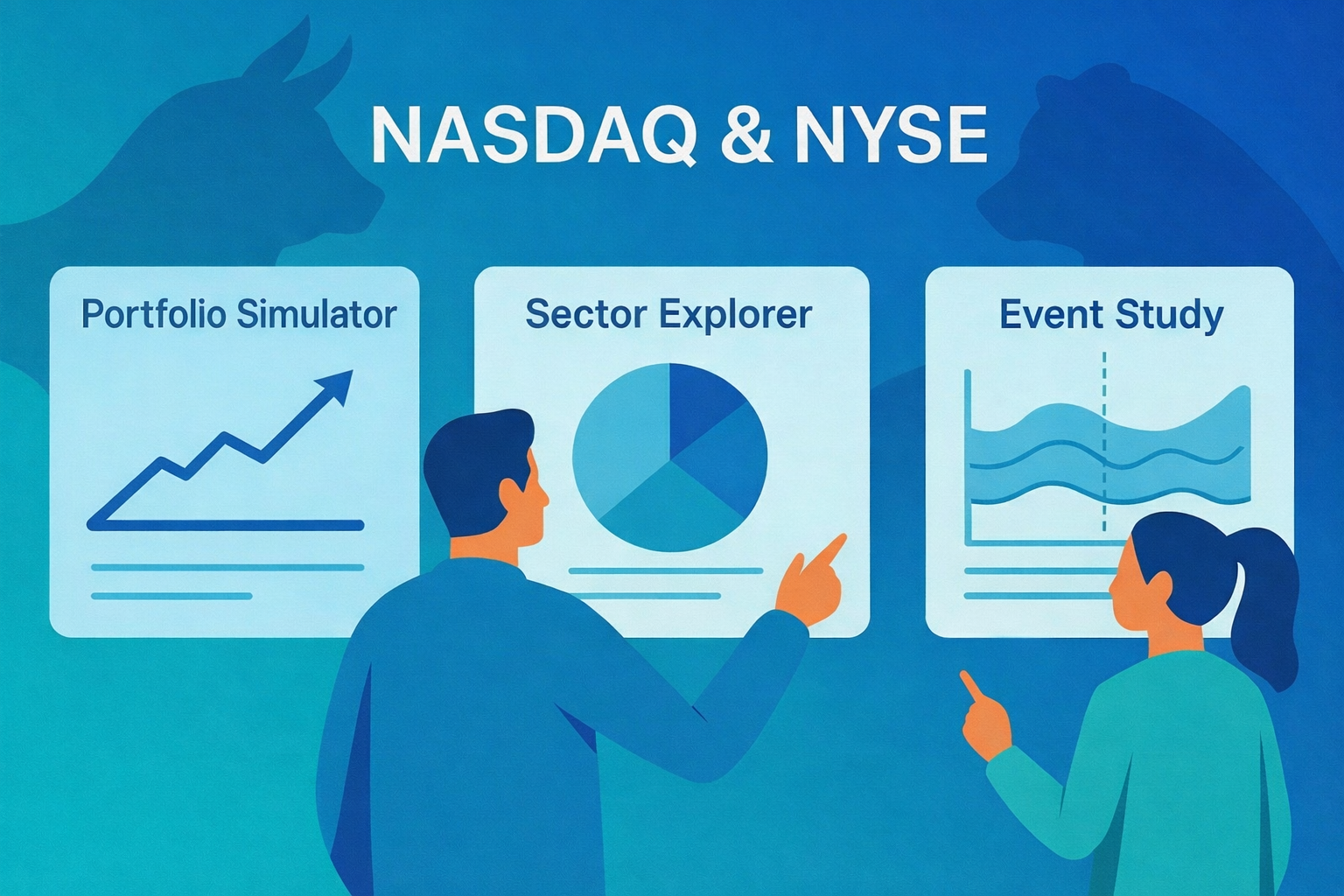
In this post, I’ll walk through a python shiny stock app I built to learn about markets hands-on. It bundles three tools-a Portfolio Simulator, Sector Explorer, and Event Study-so you can experiment with real NASDAQ & NYSE data without writing new code each time.
Note that this is intended for educational purposes only and should not be taken as financial advice.
Live app: Portfolio, Sector & Event Lab
Why I built this
I built this python shiny stock app to give investors a single place where they can quickly explore their ideas and make more informed buying and selling decisions. In one workflow, you can backtest simple buy-and-hold strategies, compare sector performance side by side, and quantify how stock prices react to real events like earnings or SEC filings.
The whole design leans into learning-by-doing: minimal clicks, assumptions stated up front, and exportable outputs you can take with you for deeper follow-up analysis.
Some real questions
- “I’m holding a small basket of stocks—say AAPL, NVDA, and PLTR—and I want to see how a simple buy-and-hold over a recent window would have actually played out. What would my path and final return have looked like?” (See chart below.)
- With the Portfolio Simulator, I enter the tickers, set a date window, choose Equal vs. Inverse-price weighting, and hit Run. The app buys once at t₀ (the start of the selected window), then shows portfolio wealth, total return, and per-ticker normalized lines. There’s no rebalancing and no transaction costs-just a clean view of how that specific buy-and-hold position would have played out over the chosen period.
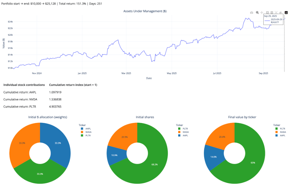
So, the answer to that first “real question” is: over this specific recent window, a simple equal-dollar buy-and-hold in AAPL/NVDA/PLTR would have more than doubled your money, with PLTR doing most of the heavy lifting.
- “I’m thinking about trading AAPL around 10-Q filings. Historically, have AAPL’s returns tended to react positively or negatively in the days around those filings?” (See chart below.)
- With the Event Study, I choose the filing type (e.g., 10-Q), enter the ticker, set a date range and an event window in relative days, and hit Run. The app calculates and plots cumulative abnormal returns around each event, giving a compact view of how the stock has historically behaved in the days before and after those filings.
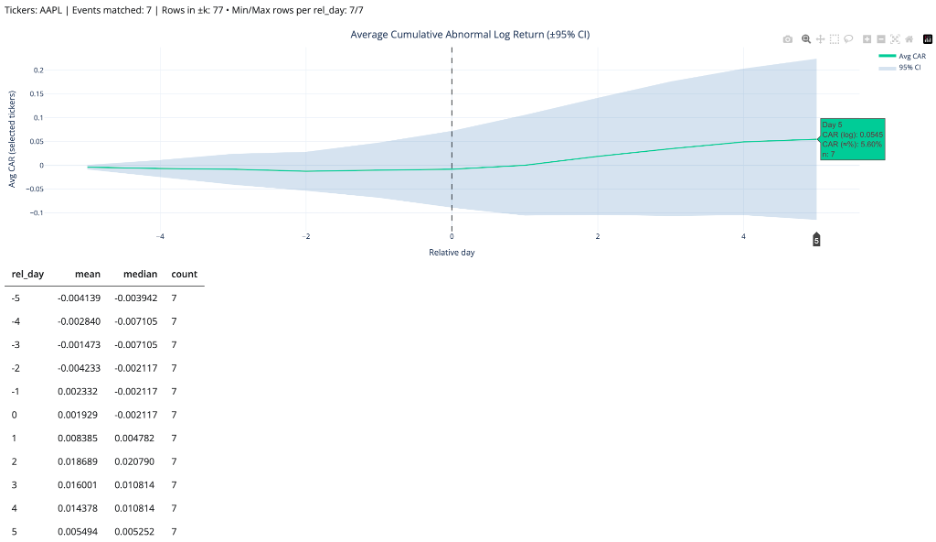
So, the answer to the second “real question” is: in this sample, AAPL has on average drifted slightly down or sideways before 10-Q filings, then shows a modest positive abnormal move-around +5-6%-in the days following the filing (out to day +5), albeit with plenty of variability across events.
What you can do (fast)
- Portfolio Simulator
- Set tickers and dates; choose Equal (1/N) or Inverse-price (1/price₀); run.
- Outputs: wealth curve, total return, optional daily returns, per-ticker normalized lines, CSV export.
- Sector Explorer
- Pick sectors and a window; build equal-weight sector indices (base=1) and view returns/rolling stats.
- Outputs: indexed curves + simple table of window returns (cap-weighting on the roadmap).
- Event Study
- Enter one or more dates and a ± window (trading days).
- Outputs: AR/CAR by event and an average path when multiple dates are provided; day-0 aligned plot; CSV. (Expected return = 0 → ARₜ = rₜ)
Under the hood (transparent by design)
I built the dataset myself to avoid rate-limit surprises and keep the python shiny stock app feeling snappy even when working with thousands of tickers. The notebook pulls NASDAQ + NYSE tickers, filters out non-common stocks, downloads price history via yfinance, and writes a tidy daily panel suitable for quick analysis.
The pipeline saves both Parquet and CSV and is safe to re-run. It merges fundamentals, computes returns, and writes analysis_enriched.parquet/.csv. For the live app, I ship a compact outputs/sample.parquet slice (1-year window). That way the UI stays snappy, while the full 3-year panel remains in outputs/analysis_enriched.parquet.
The presentation summarizes scope and scale-~3.8M+ rows across 31 columns-covering thousands of U.S. tickers with filing/split annotations. Visit my GitHub repo for more details on the dataset builder pipeline, sample builder and app scripts.
Try it yourself
- Portfolio: AAPL MSFT PLTR QUBT (last 12 months) → compare Equal vs Inverse-price.
- Sectors: Technology, Healthcare, ETF/Fund → normalize to base=1; scan drawdowns.
- Events: Forms 144 and 144/A, Technology sector, 2024/09/30-2025/09/30, k=3 → inspect AR/CAR around day 0.
Roadmap for the python shiny stock app
- Market-cap and other weighting schemes.
- Event baselines (constant-mean / market-model / Fama-French).
Credit
Grateful to NYC DSA mentors/alumni for thoughtful feedback and to the maintainers of Shiny for Python, yfinance, yahoo_fin, yahooquery, and the SEC EDGAR team.
Leave a Reply