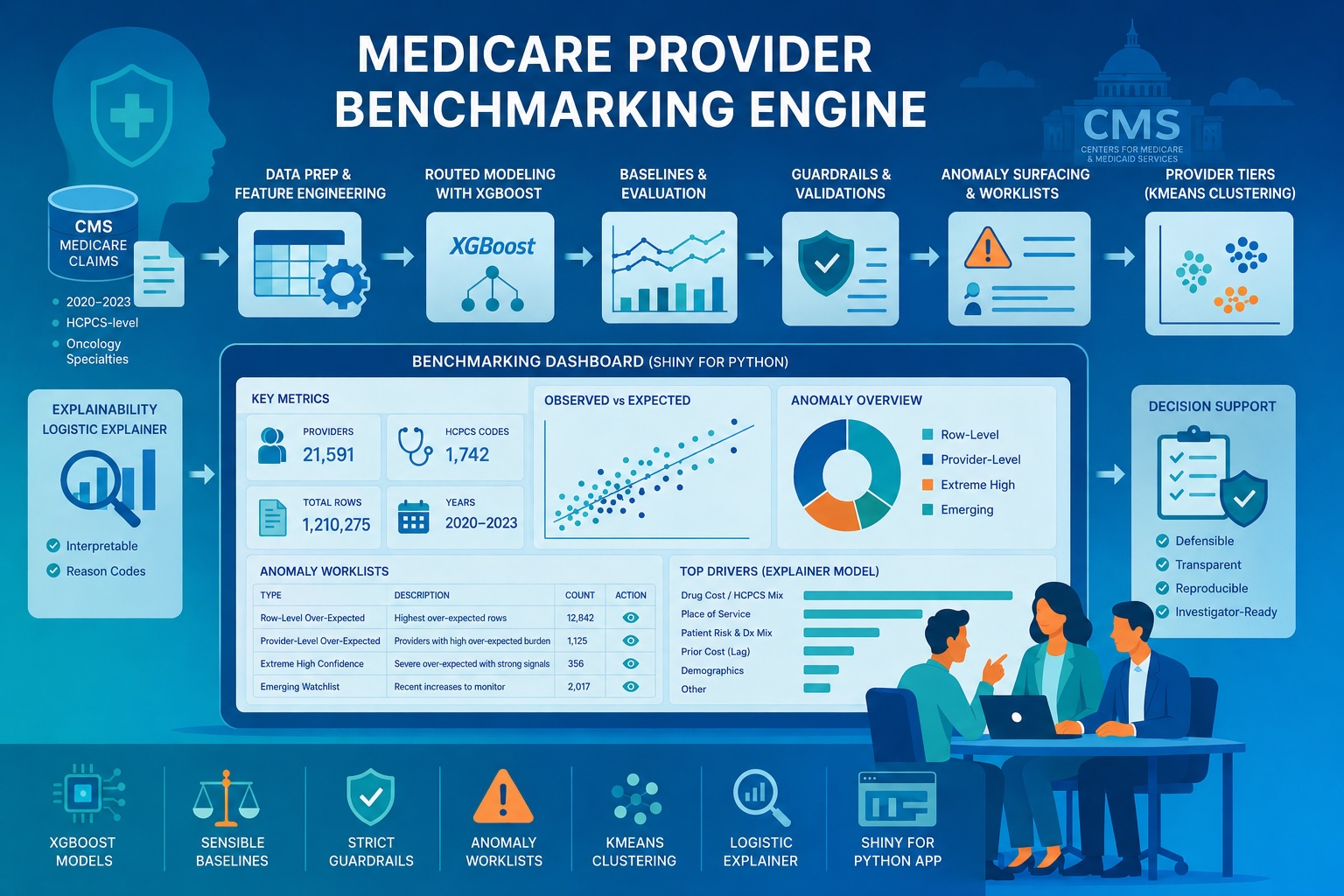
Building a Medicare Provider Benchmarking Engine for expected-cost estimation, anomaly surfacing, provider tiering, and explainability
Healthcare claims data is inherently adversarial: it is massive, noisy, and clinical variation often masks billing irregularities. For payers, the hard part isn’t finding outliers. It’s building a scalable, defensible way to separate expected clinical variation from patterns worth manual review. My capstone addresses this by transforming raw CMS claims into a statistically grounded benchmarking engine that surfaces over-expected behavior relative to a provider’s peer group.
The result was the Medicare Provider Benchmarking Engine, an end-to-end system built on four years of real CMS Medicare provider-service data at HCPCS-level grain. For this version of the engine, I focused the cohort on oncology-related rendering provider specialties: Hematology-Oncology, Medical Oncology, Radiation Oncology, Gynecological Oncology, and Surgical Oncology.
It combines:
- robust exploratory data analysis,
- supervised modeling for expected-cost estimation,
- post-model guardrails,
- row-level and provider-level anomaly surfacing,
- provider tiering through clustering,
- an interpretable logistic explainer model,
- and an interactive Shiny for Python dashboard for navigating results.
Project at a Glance:
- The Problem: Healthcare payers need scalable ways to distinguish expected clinical variation from billing patterns requiring investigation.
- The Solution: A routed machine-learning benchmarking engine using 4 years of CMS Medicare data to estimate expected costs at the provider-service level.
- The Output: Four distinct, support-aware anomaly triage watchlists delivered through an interactive Shiny for Python dashboard.
- Key Techniques: Supervised expected-cost estimation, unsupervised provider clustering, logistic explainer models, and strict post-model guardrails.
Ultimately, this is a decision-support workflow: estimate expected cost, compare to peers, and surface over‑expected patterns in a cautious, explainable way. Importantly, this system does not label providers as fraudulent; instead, it builds a reproducible pipeline to flag over-expected behavior that warrants deeper investigation.
Project goal
The goal was to build a benchmarking system that could:
- estimate expected standardized Medicare amount at the provider-service level,
- compare observed versus expected behavior in a peer-relative framework,
- surface rows and providers that repeatedly appear unusually over-expected,
- group providers into defensible risk-style tiers based on anomaly burden,
- and expose the full workflow in an interactive application.
From the start, I optimized for downstream triage: stable scoring, defensible comparisons, and transparent reasons a row got flagged.
Table of contents
- Data Foundation
- Exploratory Data Analysis
- Modeling Framework
- Guardrails & Model Governance
- D/G + V3 Operational Performance
- Anomaly Worklists
- Provider Tiering
- Logistic Explainer
- Interaction Dashboard
The data foundation
I built the project using CMS Medicare data from 2020 through 2023, scoped to oncology-related rendering provider specialties: Hematology-Oncology, Medical Oncology, Radiation Oncology, Gynecological Oncology, and Surgical Oncology, and engineered the final modeling dataset at the following grain: (Rndrng_NPI, HCPCS_Cd, Place_Of_Srvc, Year). This kept the benchmarking problem clinically focused while still preserving enough scale and diversity across provider types, HCPCS codes, and care settings to support robust modeling and anomaly surfacing.
That modeling grain mattered for both prediction quality and anomaly interpretability. While I initially explored the broader RBCS (Restructured Betos Classification System) family level, the inherent clinical variance within those groupings was too high for precise benchmarking. Transitioning to the HCPCS-code level provided the clinical specificity required for true “apples-to-apples” comparisons, significantly reducing the likelihood of flagging complex legitimate case mixes as mere anomalies.
Final HCPCS-level dataset
The final dataset contained:
- 1,210,275 rows
- 21,591 unique NPIs
- 1,742 HCPCS codes
- 2 place-of-service categories
- 4 years of data (2020 to 2023)
Table-1: High-level HCPCS-level dataset summary
| Row grain* | Total rows | Unique providers (NPI) | Unique HCPCS | Unique POS | Unique Years |
|---|---|---|---|---|---|
(Rndrng_NPI, HCPCS_Cd, Place_Of_Srvc, Year) | 1210275 | 21591 | 1742 | 2 | 4 |
*Each row represented a provider’s behavior for a specific procedure or drug code, in a specific care setting, during a specific year.
Exploratory data analysis: Why a one-size-fits-all model fails
The first major lesson from EDA was that this problem could not be handled well by a single blunt modeling strategy. The data was large enough to be meaningful, but uneven enough to be dangerous. Support varied sharply across slices, cost behavior was highly skewed, and historical lag signal was strong when present but absent for many rows. Those three findings shaped the routed modeling architecture that followed.
- Coverage and mix
The first thing I wanted to understand was the dataset’s scope, time coverage, and structural balance across years, place of service, and geography.
Figure-1: rows per year
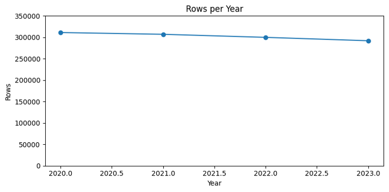
Figure-2: Providers per year
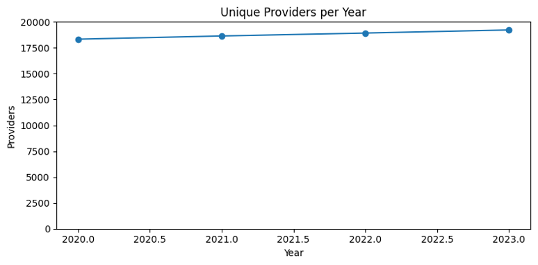
Figure-3: Total services per year
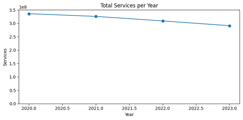
Figure-4: Place-of-service distribution
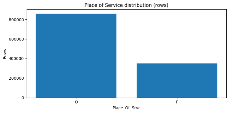
Figure-5: Place-of-service distribution by year
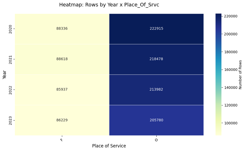
Figure-6: Top-state by row
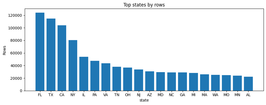
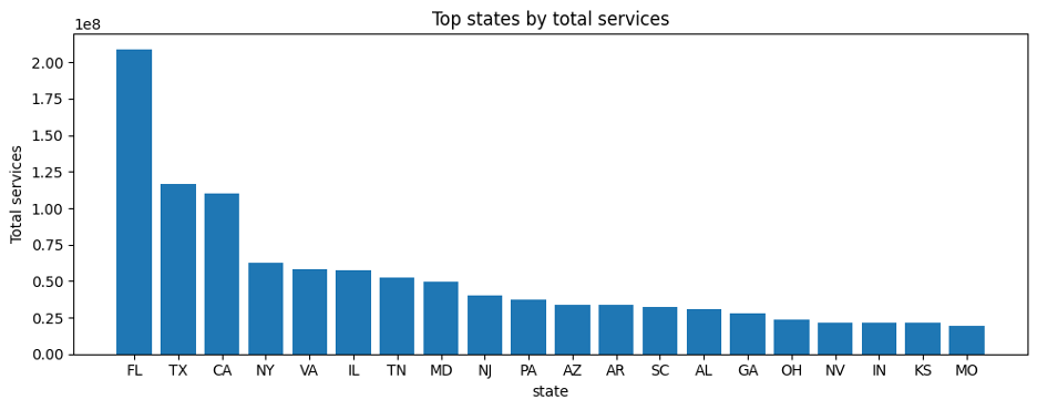
Figure-7: Top-state by row
A few patterns stood out immediately:
- The dataset remained large and operationally meaningful across all four years.
- Provider count rose modestly over time, even as row count and total services declined somewhat.
- The data was dominated by office-based rows, with facility rows making up a smaller but still meaningful share.
- A handful of states contributed a disproportionate share of rows and services.
These patterns aren’t just descriptive. They determine who you can fairly compare, and where the statistics are trustworthy.
- Exposure and reliability
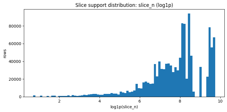
A second lesson from EDA was that not all rows deserve equal trust. Some provider-service observations are backed by meaningful service volume and beneficiary count. Others are much thinner.
Figure-8: Raw beneficiaries distribution
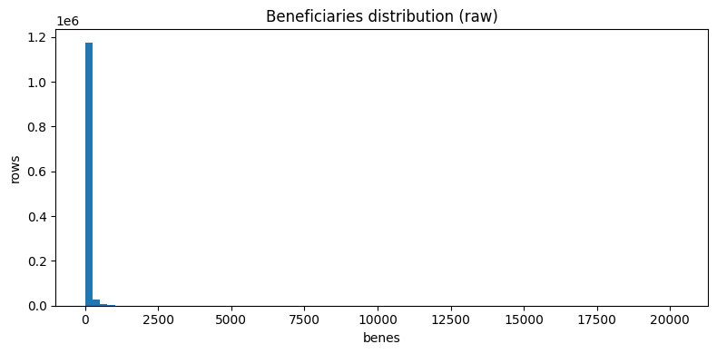
Figure-9: log-transformed beneficiaries distribution
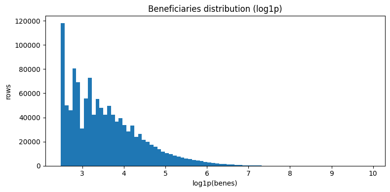
Figure-10: Raw services distribution
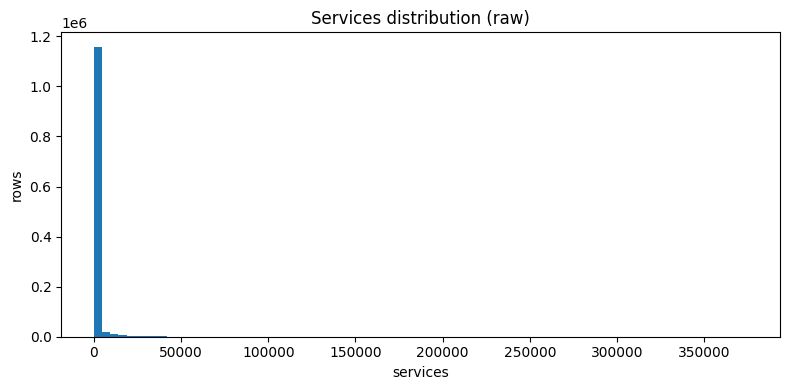
Figure-11: log-transformed services distribution
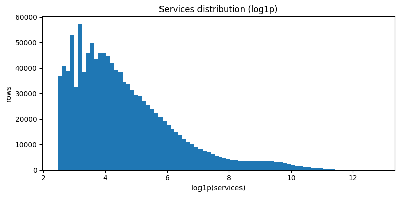
Figure-12: Provider exposure distribution
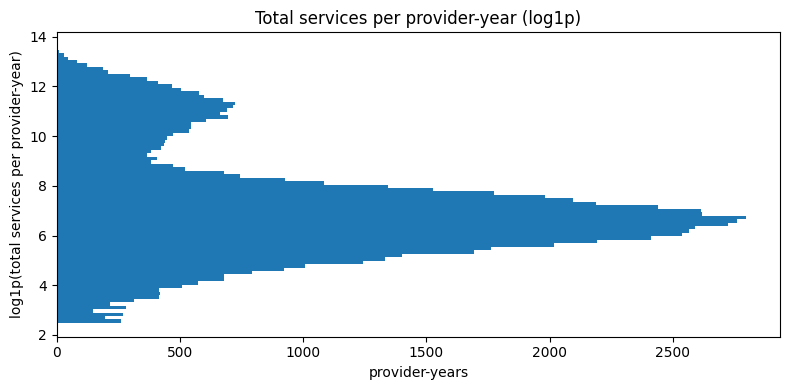
Figure-13: HCPCS slice support distribution for (HCPCS_Cd, Year)
- Cost behavior and lag structure
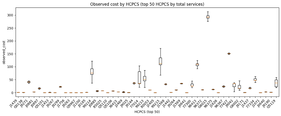
The EDA also showed that standardized amount distributions were highly right-skewed and varied materially by HCPCS code. That made intuitive sense in oncology-related Medicare data, where some codes reflect relatively routine administration while others reflect expensive infused therapies or complex treatment activity.
Bottom line: anomaly surfacing had to be support-aware. Extreme values in tiny peer slices shouldn’t carry the same weight as extremes in well-supported slices.
Figure-14: Raw observed cost distribution
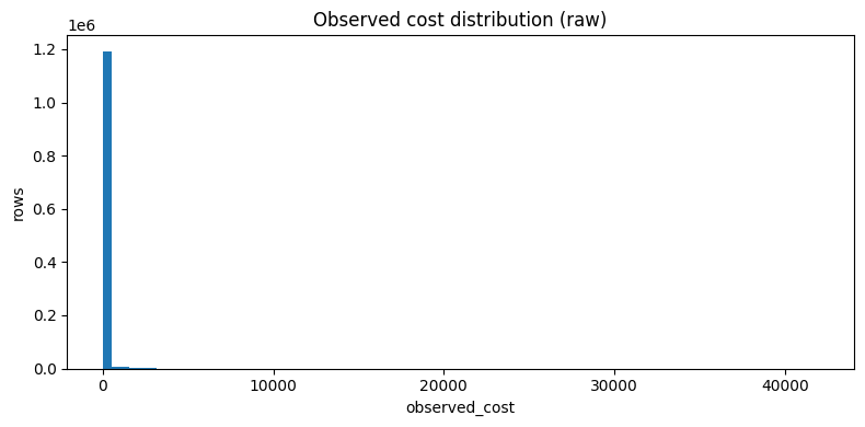
Figure-15: log-transformed observed cost distribution
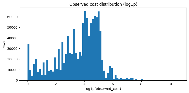
Figure-16: Observed cost by top HCPCS codes
- Historical coverage structure
A final structural feature of the dataset was historical coverage. Some provider-service-place-year rows had usable prior-year history, while others were true cold-start rows. That mattered because prior cost is a well-established predictor in Medicare spending and utilization modeling1,2, but it is not available uniformly across the full scoring universe. In parallel with this benchmarking work, I also spent substantial time experimenting with forecasting-style approaches built around lag structure, which reinforced how informative prior history can be when it is available. I discuss that forecasting work in more detail in the GitHub repository and plan to cover it more fully in future blog posts.
Figure-17: Lag coverage by year
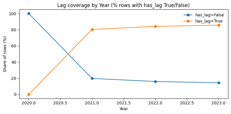
The key EDA takeaway was structural: the benchmark universe mixes very different information environments (support depth, lag availability, and heavy skew). Some rows had rich prior-year history while others were true cold-starts. Some sat in massive, well-supported peer slices while others were sparse. And the target remained aggressively right-skewed throughout. That heterogeneity made it clear that a monolithic one-size-fits-all model would be a poor fit for the problem.
Regression modeling and routed expected-cost estimation
The modeling objective was to estimate the row-level expected standardized Medicare amount for each provider-service-place-year slice. But the deeper challenge was not simply to fit the best global model. It was to build a benchmarking engine that would remain useful for downstream anomaly surfacing and generalize to new providers the model had never seen before.
That design choice shaped the evaluation framework from the start. I used provider-disjoint train/test splits and provider-aware cross-validation so the same NPI could not appear in both training and evaluation.
To remain useful for downstream anomaly surfacing, the model had to be evaluated not just by global RMSE or R², but by how it behaved in the tail (i.e., services whose per unit cost is within the top 1% of all services provided in that specific year).
Why tail behavior mattered
The rows that drive action are the ones with big positive observed‑over‑expected gaps. If the model systematically underpredicted the upper tail, it would manufacture misleading anomalies, but if it over-smoothed true variation, it would hide useful signals.
So, I evaluated models using both standard metrics and tail-aware diagnostics, including:
- weighted RMSE,
- tail prediction-to-actual ratio,
- and tail bias.
That requirement changed how I evaluated models: I cared as much about tail behavior as aggregate RMSE.
Baselines
I compared several non-ML baselines and found that prior-year lag cost for the same provider, place of service, and HCPCS slice was one of the strongest simple predictors. That was not surprising. In healthcare cost forecasting and administrative claims settings, prior history is often one of the most informative signals available, so the baseline exercise served as both a benchmark and a structural diagnostic.
The baseline results mattered because they confirmed something the EDA had only hinted at structurally: rows with usable prior history and rows without it were not equally easy prediction problems. Prior-year lag was a powerful signal when available, but a real benchmarking engine also had to cover true cold-start rows where no such anchor existed. That became one of the main reasons I treated lag-present and lag-absent rows differently in the final modeling architecture.
Baseline A. Lag only
- Predict the current row’s
avg_mdcr_stdzd_amtusing onlylag1_avg_amt. - Evaluated only on rows where lag exists, because this baseline cannot score true cold-start rows.
- Conceptually, this is the pure carry-forward baseline: “assume this provider-service-place slice looks like last year.”
What it tests: how much predictive power is already present in simple historical carry-forward.
Baseline B. Lag + backoff mean
- Predict with
lag1_avg_amtwhen lag exists. - If lag is missing, back off to the training-set mean at (
provider_type, HCPCS_Cd, Place_Of_Srvc). - If that is unavailable, back off again to the HCPCS-only training mean, then finally to the global training mean.
What it tests: whether a very simple hybrid of lag plus hierarchical means can provide broad coverage without machine learning.
Baseline C. Provider-type + POS + state mean
- Ignore lag entirely.
- Predict using the training-set mean at (
provider_type, Place_Of_Srvc, state). - If that mean is unavailable, fall back to the global training mean.
What it tests: whether a coarse peer-group average can serve as a reasonable cold-start baseline.
Baseline D. Full backoff ladder
- Ignore lag entirely.
- Predict using a more detailed hierarchy of training-only means:
- (
provider_type, HCPCS_Cd, Place_Of_Srvc, state) - then (
provider_type, HCPCS_Cd, Place_Of_Srvc) - then
HCPCS_Cd - then (
provider_type, Place_Of_Srvc, state) - then (
provider_type, Place_Of_Srvc) - then
provider_type - then global mean
- (
What it tests: how far a carefully designed, no-ML hierarchical benchmark can go for true cold-start scoring.
Table-2: Non-ML baseline summary
| Label | Type | Description | R2 test | MAE | RMSE | R2 test weighted | MAE weighted | RMSE weighted | Tail pred / y | Tail bias |
|---|---|---|---|---|---|---|---|---|---|---|
| Baseline A | Baseline | Lag only | 0.942565 | 5.707927 | 38.946548 | 0.929433 | 17.683063 | 109.379102 | 1.078064 | 111.758282 |
| Baseline B | Baseline | Lag + backoff | 0.930421 | 8.619110 | 55.014137 | 0.941156 | 27.599187 | 136.109130 | 0.975051 | -42.206414 |
| Baseline C | Baseline | PT + POS + state mean | 0.058866 | 72.994691 | 202.329669 | -0.007190 | 187.663518 | 563.107099 | 0.087527 | -1543.616931 |
| Baseline D | Baseline | Full backoff ladder | 0.931978 | 9.889925 | 54.394893 | 0.950689 | 30.051029 | 124.596617 | 0.920057 | -135.238878 |
The strongest baselines performed surprisingly well. That was a useful finding, not an inconvenience. It meant the final model architecture had to justify itself against serious alternatives, especially lag-only and lag-plus-backoff strategies.
XGBoost regression families
After establishing the non-ML reference points, I moved to supervised regression models. I initially tested ordinary least squares as a simple modeling baseline, but the structure of the data quickly made a tree-based approach more appropriate. The relationships between provider type, HCPCS code, place of service, patient risk mix, service volume, geography, prior history, and expected standardized amount were nonlinear and highly interactive.
I used XGBoost regression because it could capture those nonlinear relationships while still fitting naturally into a reproducible scikit-learn-style pipeline with preprocessing, cross-validation, sample weighting, and artifact persistence.
Across the XGBoost model packages, I varied several design choices:
- whether lag features were included,
- whether top-tail rows received higher sample weight,
- whether the model predicted the expected amount directly or predicted a delta relative to lag,
- and whether hyperparameters were selected with grid search or randomized search.
All model packages were evaluated in a provider-disjoint new-provider framework. I used GroupShuffleSplit for the train/test split and GroupKFold for cross-validation so the same Rndrng_NPI could not appear in both training and evaluation.
Direct level prediction
The first XGBoost family predicted the expected standardized Medicare amount directly:
These models asked the algorithm to learn the expected dollar-level amount from the available row features. I tested both with-lag and no-lag variants.
The no-lag direct models were especially important because they represented the cold-start path. If a provider-service-place row had no valid prior-year history, the engine still needed a defensible way to estimate expected cost.
This is where Model D became important. It did not use lag features, but it used service code, place of service, provider type, geography, case-mix proxies, and volume features to make a direct expected-cost prediction for true cold-start rows.
Delta-target modeling
For lag-available rows, I tested a second XGBoost family that reframed the prediction task. Instead of predicting the raw expected amount directly, the model predicted the log-relative change from the prior-year amount:
This changed the question from ‘What is the expected absolute amount?‘ to ‘How much should this row move relative to its own recent history?‘
That formulation helped because it anchored prediction to a meaningful prior value. The model no longer had to relearn the entire static cost structure of the Medicare system from scratch. Instead, it could focus on explaining deviations from prior behavior using current row context.
For lag-available rows, this was a better formulation than naive level prediction. It stabilized the right-skewed target and improved tail calibration, which mattered because downstream anomaly surfacing depended heavily on the model’s behavior in the upper tail.
Model G emerged from this family. It used lag features, top-tail sample weighting, and a delta target. Its final dollar-level prediction was reconstructed by applying the predicted log-delta back to the prior-year lag amount.
Table-3: XGBoost regressor model summary
| Label | Type | Description | R2 train | R2 test | MAE | RMSE | R2 test weighted | MAE weighted | RMSE weighted | Tail pred / y | Tail |
|---|---|---|---|---|---|---|---|---|---|---|---|
| Model A | Model | wt1 with lags, level, grid | 0.715032 | 0.768979 | 12.333052 | 100.244215 | 0.768979 | 12.333052 | 100.244215 | 0.810185 | -321.107964 |
| Model B | Model | wt1 without lags, level, grid | 0.715638 | 0.760929 | 14.993705 | 101.975945 | 0.760929 | 14.993705 | 101.975945 | 0.753707 | -416.650689 |
| Model C | Model | wt10 with lags, level, grid | 0.759782 | 0.804760 | 17.688952 | 92.154814 | 0.798161 | 41.802460 | 252.079967 | 0.868736 | -222.057183 |
| Model D | Model | wt10 without lags, level, grid | 0.883025 | 0.886899 | 13.867930 | 70.140176 | 0.920303 | 30.880678 | 158.400588 | 0.922783 | -130.626763 |
| Model E | Model | wt10 with lags, level, rs50 | 0.669514 | 0.725958 | 21.165937 | 109.179882 | 0.708240 | 50.903769 | 303.073671 | 0.788339 | -358.064019 |
| Model F | Model | wt10 without lags, level, rs50 | 0.748883 | 0.789285 | 19.294453 | 95.737380 | 0.804227 | 43.422870 | 248.262741 | 0.864591 | -229.068779 |
| Model G | Model | wt10 with lags, delta, grid | 0.995563 | 0.933416 | 3.493940 | 43.006421 | 0.975015 | 6.752066 | 67.723853 | 0.995876 | -5.894139 |
| Model H | Model | wt10 with lags, delta, rs50 | 0.986865 | 0.930269 | 3.941185 | 44.010877 | 0.972997 | 7.393144 | 70.405245 | 0.992898 | -10.149489 |
| Model I | Model | wt10 without lags, delta, rs50 | 0.988122 | 0.904079 | 4.632643 | 51.618434 | 0.970215 | 8.527295 | 73.942416 | 0.999560 | -0.628872 |
The model comparison made the final architecture clearer. No single standalone model solved every problem. The best lag-informed delta model was excellent where history existed, while the best no-lag direct model provided the cold-start path needed for full-universe scoring. That is what led to the final D/G routed architecture.
Validation stability and why slightly higher test R² was not a red flag
You might notice something odd: a few packages scored slightly higher on holdout R² than on training R². In a provider-disjoint setup, that can happen when the holdout provider mix is simply easier. Some held-out providers may have more stable HCPCS patterns, less extreme tail behavior, stronger representation in common service-code contexts, or fewer sparse slice combinations.
Because the packages were evaluated in a provider-disjoint new-provider framework, the same NPI could not appear in both training and holdout data. That means the holdout set was not just a random sample of rows. It was a distinct provider subset. So I treated the pattern as a split-difficulty question rather than a leakage conclusion, then checked it against provider-disjoint cross-validation fold performance.
The result was reassuring. For packages A, C, and E, the holdout test R² fell within the observed cross-validation fold range. For B, D, and F, the holdout score was only modestly above the best validation fold, which is more consistent with a somewhat easier holdout provider mix than with leakage.
This strengthened the credibility of the package-level comparison. I did not rely on one split and assume the scores were stable. I explicitly checked whether holdout behavior was consistent with grouped validation behavior, which made the later selection of Models D and G more defensible.
Table-4: Test vs CV R² summary
| Package | CV mean R² | CV min | CV max | Holdout test R² | Within CV fold range? | Interpretation |
|---|---|---|---|---|---|---|
| A | 0.728782 | 0.601176 | 0.861477 | 0.768979 | Yes | Consistent with ordinary grouped split variation |
| B | 0.687919 | 0.650020 | 0.744988 | 0.760929 | No | Holdout likely slightly easier than average CV fold |
| C | 0.745222 | 0.658963 | 0.824130 | 0.804760 | Yes | Consistent with ordinary grouped split variation |
| D | 0.851190 | 0.816009 | 0.874499 | 0.886899 | No | Holdout likely slightly easier than average CV fold |
| E | 0.687602 | 0.564634 | 0.814412 | 0.725958 | Yes | Consistent with ordinary grouped split variation |
| F | 0.719588 | 0.685313 | 0.761111 | 0.789285 | No | Holdout likely slightly easier than average CV fold |
The final winning architecture
The final winner was not a single standalone model. It was a routed architecture designed to solve two prediction problems inside the same scoring engine.
The turning point was realizing that the best model on the lag-available subset could not be the whole system. A payer workflow still needs to score true cold-start rows, where no prior-year anchor exists. That is where the final D/G strategy emerged:
- Model D for true cold-start rows through direct expected-cost prediction without lag features.
- Model G for lag-available rows through lag-informed delta-target prediction, followed by reconstruction back to the expected dollar level.
This routing gave the engine something a pure lag model could not: full-universe operational coverage. Hot-start and cold-start rows were not just different slices of the same problem. They had different information depth, so they needed different prediction strategies.
This also changed the evaluation question. The individual D and G packages were developed and stress-tested in a provider-disjoint new-provider framework using GroupShuffleSplit holdouts and GroupKFold cross-validation. The final D/G system, however, was evaluated as a routed operational engine on the full evaluation universe. At that point, I was no longer asking only, “Which standalone model wins?” I was asking, “How well does the complete scoring engine behave once every row is routed to the appropriate prediction path?”
Table-5: D/G routing architecture
| Scenario | Trigger Condition | Assigned Route | Model Deployed | Prediction Methodology |
|---|---|---|---|---|
| Hot Start | Previous year cost data (Lag) is present and ≥ 0. | hot_start_model_G | Model G (_wt10_with_lags_delta_trgt) | Predicts the log delta (change in cost). The final expected cost is reconstructed by applying this predicted change to the actual historical lag. |
| Cold Start | No valid historical cost data exists. | cold_start_model_D | Model D (_wt10_without_lags) | Predicts the level cost directly without utilizing lag features. Output is hard-clipped at 0 to prevent negative cost predictions. |
Leakage audit suite for the winning models D and G
Because this project feeds downstream anomaly worklists, I did not want to rely on strong metrics alone. I wanted to stress-test the winning component models against the most plausible leakage pathways and confirm that their performance patterns still made sense under grouped validation and negative-control checks.
Importantly, the leakage audits were run on the winning standalone packages Models D and G, because those were the learned components inside the final routed engine. The final D/G routing layer itself was deterministic and operationally transparent, but the learned parts of the system still needed to be audited carefully.
For Model D, the leakage audit focused on classic new-provider leakage risks. I verified that the train/test split was fully provider-disjoint, that cross-validation was also provider-disjoint, that Model D excluded lag features and obvious target-adjacent payment features, and that preprocessing was fit using training-only information rather than full-dataset statistics. I also ran stronger sanity checks. Removing HCPCS_Cd materially degraded performance, and shuffling the training target caused model performance to collapse. That pattern supports the conclusion that Model D was learning real service-level structure rather than benefiting from hidden leakage.
For Model G, the audit had to be stricter because it uses historical lag information by design. I again confirmed fully provider-disjoint train/test and cross-validation splits. Then I audited lag lineage by recomputing the lag feature from the full original EDA source and comparing it row by row to the persisted modeling feature. I also recomputed the delta target itself and verified that it matched the modeled target construction exactly. On top of that, I ran negative-control checks that should fail if the model is learning real signal. When I shuffled the delta target, delta-space performance collapsed. When I intentionally broke lag alignment, performance deteriorated materially.
The leakage audit did more than check for contamination. It tested whether the observed performance patterns were logically consistent with genuine predictive structure. Lag-only was already a strong baseline, but Model G improved materially on tail calibration, tail bias, and tail error behavior, which is the pattern I would expect from real value-add rather than a shortcut created by leakage. Taken together, these checks support a more defensible conclusion: the D/G architecture performed well for structural reasons that survived provider-disjoint evaluation, target-lineage checks, preprocessing inspection, and negative-control stress tests.
Table-6: Leakage audit summary
| Model | Check | Result | Interpretation |
|---|---|---|---|
| Model D | Train/test provider overlap | 0 overlapping providers | PASS. GroupShuffleSplit train/test split is fully provider-disjoint. |
| Model D | CV provider overlap | 0 overlapping providers in every fold | PASS. GroupKFold validation is fully provider-disjoint. |
| Model D | Feature audit | No lag features, no payment-side target-adjacent variables | PASS. Direct-cost model excludes the obvious leakage-prone feature families. |
| Model D | Preprocessing fit scope | Package-aligned imputer statistics match training data | PASS. Numeric and categorical preprocessing were fit on training data only. |
| Model D | HCPCS ablation | R2 test dropped from 0.751685 to 0.584979 | Removing HCPCS_Cd from features leads to strong decline in model performance. |
| Model D | Negative control with shuffled y_train | R2 test collapsed from 0.751685 to -0.054324 | Very strong anti-leakage evidence. Destroying target structure collapses predictive power. |
| Model G | Train/test provider overlap | 0 overlapping providers | PASS. GroupShuffleSplit train/test split is fully provider-disjoint. |
| Model G | CV provider overlap | 0 overlapping providers in every fold | PASS. GroupKFold validation is fully provider-disjoint. |
| Model G | Lag lineage check | 748,680 / 748,680 rows matched, 100.0% | PASS. lag1_avg_amt exactly matches prior-row values recomputed from full original EDA source. |
| Model G | Delta target construction | 748,680 / 748,680 rows matched, 100.0% | PASS. log_delta_cost is constructed exactly as log1p(current) - log1p(lag). |
| Model G | Feature audit | Intentional lag features only, no payment-side target-adjacent variables | PASS. Uses historical lag by design, not current-row target proxies. |
| Model G | Lag-only baseline | R2 test = 0.857768, RMSE = 62.856022 | Strong baseline. Confirms real historical structure already exists in the problem. |
| Model G | Model G replica | R2 test level = 0.933416, RMSE level = 43.006421, R2 test delta = 0.565856 | Substantial gain beyond lag-only baseline. |
| Model G | Negative control, shuffled y_train_delta | R2 test collapsed from 0.565856 to -0.004571 | Very strong anti-leakage evidence. Destroying target structure collapses delta predictive power. |
| Model G | Tail calibration versus lag-only | Tail ratio improved 1.089586 -> 0.995876, tail RMSE improved 402.46 -> 193.25 | Model G materially improves tail calibration and tail error behavior. |
| Model G | Wrong-lag sanity test | R2 test level dropped 0.933416 -> 0.896634, RMSE worsened 43.01 -> 53.58 | Strong evidence that the model relies on real lag alignment rather than leakage. |
Post-model failure analysis, guardrails and scoring governance
Statistical excellence is the starting point, not the finish line. Even high-performing models can produce “pathological” signals in sparse or highly volatile slices. To move from a research-grade model to a production engine, I implemented a governance layer of auditable guardrails. These act as a conservative safety net for policy-sensitive edge cases, ensuring the system remains stable and defensible when scores propagate to actual investigation worklists.
This was where the project matured from a good model into a more usable engine.
Identifying modes of failure
Table-7: Key thresholds
| Metric | Treshold Value |
|---|---|
abs_resid_q99 | 108.230 |
oe_q99 | 1.777 |
resid_pos_q99 | 88.954 |
resid_neg_q01 | -35.166 |
obs_q99 | 918.900 |
exp_q99 | 1009.589 |
oe_underprediction_cut | 3.000 |
oe_overprediction_cut | 0.333 |
Using key thresholds to define failure flags
Table-8: Statistical extremes (pure math triggers)
| Flag Name | Trigger Condition | Analytical Focus |
|---|---|---|
cat_abs_residual_q99 | abs_residual ≥ 99th percentile | The top 1% largest raw dollar errors (misses in either direction). |
cat_oe_q99 | oe_ratio ≥ 99th percentile | The top 1% largest relative mark-ups (Observed was massively higher than Expected). |
cat_large_positive_residual | residual ≥ 99th percentile | The top 1% largest raw dollar underpredictions (Model predicted too low). |
cat_large_negative_residual | residual ≤ 1st percentile | The top 1% largest raw dollar overpredictions (Model predicted too high). |
Table-9: Contextual & Pipeline failures
| Flag Name | Trigger Condition | Analytical Focus |
|---|---|---|
cat_hot_failure | has_lag = True AND abs_residual ≥ 99th percentile | “Model G Miss:” The provider had historical data, but the model still suffered a massive top-1% error. |
cat_cold_failure | has_lag = False AND abs_residual ≥ 99th percentile | “Model D Miss:” The provider had no history, and the cold-start prediction suffered a massive top-1% error. |
cat_cold_low_support_failure | Cold Row AND Support Tier is medium or low AND abs_residual ≥ 99th percentile | “The Context Void:” A massive error on a new provider where we also lacked tight peer group data (relied on broad state/national averages). |
cat_large_error_high_support | Support Tier is high or medium_high AND abs_residual ≥ 99th percentile | “The Confident Miss:” A massive error despite having strong historical or tight peer-group data to anchor the prediction. |
Table-10: Operational extremes and narrative flags
| Flag Name | Trigger Condition | Analytical Focus |
|---|---|---|
cat_large_error_tail_row | Row is in the true top 1% of all costs AND abs_residual ≥ 99th percentile | “The Whale Miss:” Massive prediction errors specifically occurring on the absolute most expensive claims in the system. |
cat_underprediction | observed_cost ≥ 99th percentile AND oe_ratio ≥ 3.0 | “The Sneak Attack:” The final cost was astronomically high, but the model expected them to cost less than a third of that amount. |
cat_overprediction | expected_cost ≥ 99th percentile AND oe_ratio ≤ 0.333 | “The False Alarm:” The model predicted a massive top-1% cost, but the actual cost came in at less than a third of expectations. |
cat_high_conf_anomaly | high_confidence_anomaly_candidate = True | “The Investigation Target:” Inherits the primary anomaly flag (High Support + High Pos. Residual + High O/E). |
Table-11: The master filter
| Flag Name | Trigger Condition | Analytical Focus |
|---|---|---|
is_any_catastrophic | If ANY of the 12 flags above are True | The master Boolean used to filter the dataset down to only the problematic rows for failure analysis. |
Failure analysis summary
Table-12: Failure bucket counts
| Bucket | Row Count | Share of All Rows |
|---|---|---|
is_any_catastrophic | 32186 | 0.026594 |
cat_abs_residual_q99 | 12103 | 0.010000 |
cat_oe_q99 | 12103 | 0.010000 |
cat_large_positive_residual | 12103 | 0.010000 |
cat_large_negative_residual | 12103 | 0.010000 |
cat_large_error_high_support | 11995 | 0.009911 |
cat_cold_failure | 11025 | 0.009109 |
cat_high_conf_anomaly | 4012 | 0.003315 |
cat_large_error_tail_row | 3975 | 0.003284 |
cat_hot_failure | 1078 | 0.000891 |
cat_overprediction | 711 | 0.000587 |
cat_cold_low_support_failure | 108 | 0.000089 |
cat_underprediction | 48 | 0.000040 |
Table-13: Failure route bucket counts
| Route | Cold Start | Hot Start |
|---|---|---|
cat_abs_residual_q99 | 11025 | 1078 |
cat_oe_q99 | 10015 | 2088 |
cat_large_positive_residual | 11316 | 787 |
cat_large_negative_residual | 9177 | 2926 |
cat_large_error_high_support | 10917 | 1078 |
cat_large_error_tail_row | 3555 | 420 |
cat_underprediction | 40 | 8 |
cat_overprediction | 696 | 15 |
cat_high_conf_anomaly | 3860 | 152 |
cat_cold_low_support_failure | 108 | 0 |
cat_hot_failure | 0 | 1078 |
cat_cold_failure | 11025 | 0 |
Why guardrails were necessary
Even strong models can fail in narrow but important ways:
- under-supported cold-start slices,
- code-specific uplift phenomena,
- extreme observed-over-expected spikes,
- or small, policy-sensitive regions where model error can explode.
Rather than expecting the model to solve every edge case alone, I treated guardrails as a narrow, auditable governance layer.
V1, V2, and V3
The guardrail workflow evolved across multiple versions:
- V1 introduced bounded corrections for specific underprediction problems.
- V2 expanded targeted interventions for identifiable slice-level pathologies.
- V3 consolidated the final policy set into a governed, frozen scoring engine.
These targeted interventions included:
- Global floor logic for fragile cold-start contexts.
- Code-specific residual caps to contain extreme prediction errors.
- Multiplicative uplift corrections where model underestimation was systematic and slice-specific.
- Family-level adjustments (e.g., radiation planning cluster).
- Bounded-by-observed logic to prevent the creation of mathematically impossible negative-residual behavior.
One of the clearest examples was the C4a J2469 uplift fix, where a tightly scoped post-model correction reduced pathological observed-over-expected inflation in a known failure slice.
Table-14: Final V3 guardrail component summary
| Policy Name | Target Scope (The “Who”) | Mathematical Trigger (The “When”) | The Fix / Math (The “What”) |
|---|---|---|---|
| A1c (V0): Global Cold-Start Floor | All 2023 cold-start rows with no historical lag, especially fragile 2023-only code contexts. | Fires when expected_cost falls below a tested low trigger, such as < 0.1, < 0.5, or < 1.0. | Bounded floor override: raise expected cost toward a historical cold-start floor, using |
| B2.2b: Top-Burden Dynamic Floor | 2023 cold-start rows for Q5126 and Q5127, the highest-burden volatile 2023-only codes. | Fires when oe_ratio ≥ oe_q99, meaning the row is in the extreme O/E tail. | Dynamic escape floor: compute the exact minimum expected cost needed to escape multiple catastrophic thresholds at once, then raise prediction to that level, bounded by observed cost. |
| B2.2c: Q5127 Residual Cap | 2023 cold-start rows for Q5127 only that are still catastrophic after B2.2b. | Fires only when the row remains flagged for cat_large_positive_residual after B2.2b. | Residual cap: set the floor needed to keep residual just below the positive residual tail threshold, effectively, then |
| C4a: J2469 Shock Fix (Multiplicative Uplift) | Year 2020, J2469, medium_high tier, cold-start rows. | Fires when oe_ratio ≥ oe_q99 inside that narrow slice. | Multiplicative uplift: multiply the original expected cost by a fixed historical correction factor, about 2.010610, then cap at observed cost: |
| C4b: J2505 Volatility Clamp (Two-Sided Clamp) | Years 2020 and 2021, J2505, medium_high tier, cold-start rows. | Fires when the row hits any severe tail condition, including top 1% abs residual, top 1% positive residual, or extreme negative residual / overprediction behavior. | Two-sided clamp: This pulls severe underpredictions up and severe overpredictions down. |
| C5.v2: Radiation Planning Cluster Residual Cap | Cold-start rows for radiation planning family codes 77280, 77290, 77295, 77301, 77338, restricted to stable_all_years + medium_high tier. | Fires when the row fails any of 5 severe metrics: abs residual tail, positive residual tail, negative residual tail, O/E tail, or high-confidence anomaly candidate. | Family-level two-sided residual clamp: |
Note: All guardrails exercise surgical control and safety by masking (target isolation) and forced ceiling ()
Before-vs-after guardrail diagnostic for J2469: C.4.a guardrail policy effectiveness
Table-15: J2469 failure bucket mix by year (only buckets > 0%)
| Year | HCPCS Code | Bucket | Rate (%) |
|---|---|---|---|
| 2020 | J2469 | cat_oe_q99 | 87.916344 |
| 2021 | J2469 | cat_oe_q99 | 1.145038 |
Table-16: Policy C4a results (J2469 2020 within medium_high cold_start cold)
| Metric | Value |
|---|---|
n_rows | 2582 |
baseline_cat_rate_% | 87.916344 |
guard_cat_rate_% | 0.0 |
delta_pp | -87.916344 |
new_cat_% | 0.0 |
Final V3 guardrail diagnostics summary
Table-17: Overall summary
| Model | is_any_catastrophic Rate (%) | Delta (% Change) |
|---|---|---|
| D/G | 2.659396 | 0.000000 |
| D/G+V3 | 2.002685 | -0.65671 |
Table-18: Overall failure bucket snapshot (%, baseline vs V3) | ALL rows
| Bucket | Row Count | Baseline Rate (%) | V3 Rate (%) | Delta (% Change) |
|---|---|---|---|---|
is_any_catastrophic | 1210275 | 2.659396 | 2.002685 | -0.656710 |
cat_large_positive_residual | 1210275 | 1.000021 | 0.443370 | -0.556650 |
cat_abs_residual_q99 | 1210275 | 1.000021 | 0.468654 | -0.531367 |
cat_cold_failure | 1210275 | 0.910950 | 0.379583 | -0.531367 |
cat_large_error_high_support | 1210275 | 0.991097 | 0.461961 | -0.529136 |
cat_oe_q99 | 1210275 | 1.000021 | 0.624569 | -0.375452 |
cat_large_error_tail_row | 1210275 | 0.328438 | 0.109066 | -0.219372 |
cat_large_negative_residual | 1210275 | 1.000021 | 0.906736 | -0.093285 |
cat_overprediction | 1210275 | 0.058747 | 0.003222 | -0.055525 |
cat_cold_low_support_failure | 1210275 | 0.008924 | 0.006693 | -0.002231 |
cat_underprediction | 1210275 | 0.003966 | 0.003966 | 0.000000 |
cat_high_conf_anomaly | 1210275 | 0.331495 | 0.331495 | 0.000000 |
cat_hot_failure | 1210275 | 0.089071 | 0.089071 | 0.000000 |
Table-19: Master failure flag (is_any_catastrophic) delta (pp) | ALL years
| Year | HCPCS Stability Group | Row Count | Baseline Rate (%) | V3 Rate (%) | Delta (% Change) |
|---|---|---|---|---|---|
| 2020 | other | 4638 | 37.818025 | 7.869771 | -29.948254 |
| 2020 | stable_all_years | 306613 | 5.574454 | 3.820777 | -1.753676 |
| 2021 | other | 5467 | 15.749040 | 12.895555 | -2.853485 |
| 2021 | stable_all_years | 301629 | 1.274745 | 1.126218 | -0.148527 |
| 2022 | other | 5609 | 5.170262 | 5.170262 | 0.000000 |
| 2022 | stable_all_years | 294310 | 1.127043 | 1.022731 | -0.104312 |
| 2023 | 2023_only | 1076 | 17.100372 | 11.059480 | -6.040892 |
| 2023 | other | 3609 | 5.375450 | 5.375450 | 0.000000 |
| 2023 | stable_all_years | 287324 | 1.618034 | 1.546338 | -0.071696 |
The key principle throughout was conservatism:
- guardrails were narrow in scope,
- explicit in policy,
- auditable,
- and frozen as artifacts.
That made the final engine much more defensible than simply trusting raw model output.
Why I chose D/G + V3 over simpler baselines
The baseline suite was intentionally strong. I did not want the final system to win simply because it was more complex. In fact, one of the clearest findings from the baseline work was that simple historical carry-forward plus hierarchical backoff could go surprisingly far.
That made the final design choice more demanding, not less. The D/G + V3 architecture had to justify itself by doing more than fitting well in aggregate. It had to provide full-universe coverage, handle cold-start rows realistically, improve tail behavior where anomaly surfacing is most sensitive, and support downstream worklists without obvious pathological slices.
The final D/G + V3 architecture met those requirements by combining three layers:
- Model G for lag-available rows, where prior history was real and highly informative.
- Model D for true cold-start rows, where lag was unavailable and direct expected-cost prediction was needed.
- V3 guardrails for narrow, auditable corrections to known failure modes.
The deciding factors were not just headline R² or RMSE. They were tail-weighted error behavior, bias control, cold-start coverage, support-aware anomaly surfacing, and the ability to produce governed worklists that a stakeholder could actually investigate.
Table-20: D/G operational performance summary
| Label | Type | Description | R2 test | MAE | RMSE | R2 test weighted | MAE weighted | RMSE weighted | Tail pred/y | Tail bias |
|---|---|---|---|---|---|---|---|---|---|---|
| D/G | Engine | 2-stage final engine | 0.930327 | 8.156874 | 60.385003 | 0.940562 | 19.510174 | 152.544667 | 0.935782 | -109.17795 |
figure-18: Trimmed residual distribution
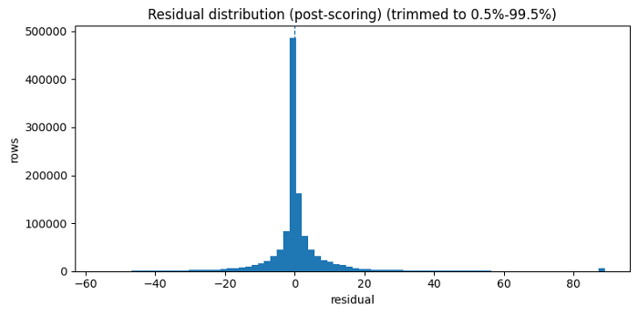
figure-19: residual variance by lag presence
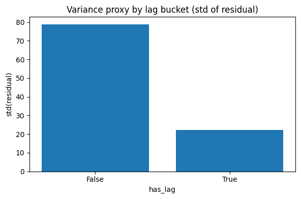
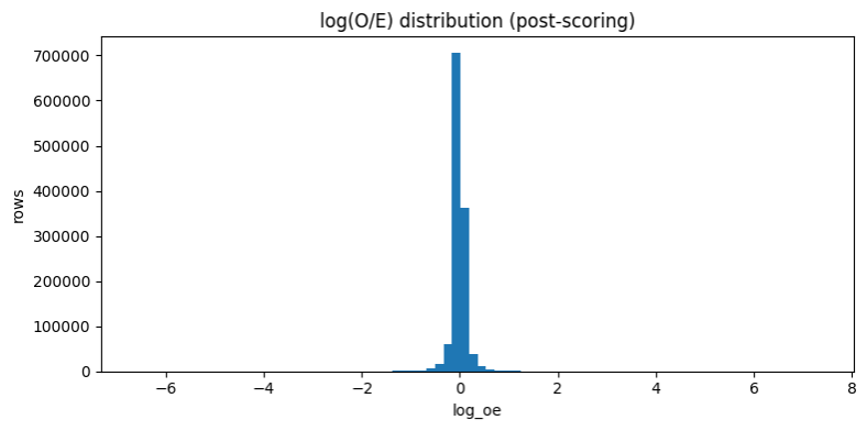
figure-20: log observed to expected cost distribution
From predictions to investigation worklists
Once the scoring engine was stable, the next challenge was turning predictions into worklists that a stakeholder could actually use. A payer does not act on RMSE alone. A payer acts on prioritized review candidates.
To ensure the engine provides actionable intelligence, I designed a dual-watchlist structure for distinct operational personas: Triage Analysts utilize row-level worklists (ANOM.2.a.1) to prioritize immediate, high-confidence review candidates. Program Integrity Leads utilize provider-level watchlists (ANOM.3.a.1) to monitor systemic, repeated over-expected behavior across multiple years and codes.
Row-level products (For immediate triage):
- ANOM.2.a.1. Robust + size-aware row worklist
This was the primary row-level product.
It asks: ‘Which rows are unusually over-expected relative to comparable peers, while also clearing support-aware confidence filters?‘
This product relied on:
- row-level observed-over-expected behavior,
- within-slice percentile ranking,
- high-confidence gating,
- and slice support awareness.
The goal was to create a defensible worklist, not a sensational one.
- ANOM.2.b.1. Magnitude + size-aware row worklist
This alternative row-level product emphasized severity. It answered a different operational question: ‘Which rows reflect the largest over-expected shocks, even if they are not the best repeat-offender examples?‘
Provider-level products
- ANOM.3.a.1. Repeat-offender provider watchlist
This provider-level product rolls up robust row-level anomaly events to the provider profile grain: (Rndrng_NPI, provider_type, state)
It effectively asks: ‘Which provider identities repeatedly show up as robust row-level tail events across codes and years?’ This is the “who consistently pops?” view.
- ANOM.3.b.1. Shock provider watchlist
This alternative provider-level product emphasizes magnitude-driven shock behavior rather than repeat frequency alone.
That makes it useful for identifying providers whose anomaly burden may be concentrated in particularly severe events.
Why I separated the anomaly products
I did not want one ranking to carry too many jobs at once. A row-level anomaly and a provider-level pattern are useful for different reasons. A single extreme row might deserve immediate review, while a provider who appears repeatedly across multiple codes or years may deserve broader monitoring.
That is why I split the outputs into four products. The row-level lists help identify specific provider-service-year observations that look unusually over-expected. The provider-level lists ask whether those signals accumulate into a repeated pattern for a provider profile.
I also separated robust signal from shock severity. Some findings are interesting because they are consistent and well-supported. Others are interesting because the magnitude is unusually large. Keeping those lenses separate made the worklists easier to interpret and reduced the risk of flattening different kinds of evidence into one overloaded score.
As throughout the project, these products are not fraud labels. They are structured review queues designed to help an analyst decide where to look next.
Table-21: Row-level anomaly surfacing approach
| Variant | Row Extremeness Description | Score Type | Directional filter | Denominator Hygiene | Slice-size Awareness |
|---|---|---|---|---|---|
| ANOM.2.a | Slice-relative tail within slice = [HCPCS_Cd, Year]: uses log_oe_pct_in_slice (pct-rank of log_oe) plus resid_pct_in_slice | Percentile-weighted () | log_oe > 0 AND residual > 0 | Optional expected_cost >= MIN_EXPECTED | No |
| ANOM.2.a.1 ✅ | Slice-relative tail + slice validity:log_oe_pct_in_slice + resid_pct_in_slice, both within [HCPCS_Cd, Year], but only for sufficiently large [HCPCS_Cd, Year] slices | Percentile-weighted () | log_oe > 0 AND residual > 0 | Optional expected_cost >= MIN_EXPECTED | ✅ slice_n >= 50 |
| ANOM.2.b | Slice-relative tail + magnitude severity: keeps log_oe_pct_in_slice + resid_pct_in_slice (within [HCPCS_Cd, Year]) and adds a capped magnitude term log_mag = clip(log_oe, 0, LOG_CLIP_MAX) / LOG_CLIP_MAX | Magnitude-aware() | log_oe > 0 AND residual > 0 | Optional expected_cost >= MIN_EXPECTED | No |
| ANOM.2.b.1 ✅ | Slice-relative tail + magnitude severity + slice validity: log_oe_pct_in_slice + resid_pct_in_slice (within [HCPCS_Cd, Year]) and adds a capped magnitude term log_mag = clip(log_oe, 0, LOG_CLIP_MAX) / LOG_CLIP_MAX, but only for sufficiently large [HCPCS_Cd, Year] slices | Magnitude-aware() | log_oe > 0 AND residual > 0 | Optional expected_cost >= MIN_EXPECTED | ✅ slice_n >= 50 |
Table-22: Provider-level anomaly surfacing approach
| Variant | Peer Extremeness Definition | Score Type | Directional Filter | Confidence Rule | Denominator Hygiene | Slice-size Awareness |
|---|---|---|---|---|---|---|
| ANOM.3.a | oe_pct_in_slice >= 0.99 | Count + breadth: | log_oe > 0 AND residual > 0 | is_high_conf OR legacy fast-track | Optional expected_cost >= MIN_EXPECTED | No |
| ANOM.3.a.1 ✅ | oe_pct_in_slice >= 0.99, but only for sufficiently large [HCPCS_Cd, Year] slices | Count + breadth: | log_oe > 0 AND residual > 0 | is_high_conf OR legacy fast-track | Optional expected_cost >= MIN_EXPECTED | ✅ slice_n >= 50 |
| ANOM.3.b | oe_pct_in_slice >= 0.99 + log_oe >= q(.995) | Count + breadth + severity bump: | log_oe > 0 AND residual > 0 | is_high_conf OR legacy fast-track | Optional expected_cost >= MIN_EXPECTED | No |
| ANOM.3.b.1 ✅ | log_oe_pct_in_slice >= 0.99+ log_oe >= q(.995), but only for sufficiently large [HCPCS_Cd, Year] slices | Count + breadth + severity bump: | log_oe > 0 AND residual > 0 | is_high_conf OR legacy fast-track | Optional expected_cost >= MIN_EXPECTED | ✅ slice_n >= 50 |
Provider tiering through clustering
Once the provider-level anomaly summaries were built, the next step was to move from ranking to segmentation.
The question became: ‘Can we group providers into interpretable anomaly-burden profiles?‘
Why cluster at all?
A ranked list is useful, but it flattens everything into one dimension. Clustering lets us ask whether providers naturally separate into broader behavioral types.
To achieve this, I built a provider feature layer utilizing:
- Robust anomaly burden and breadth (tracking consistency across codes and years)
- Shock severity metrics (capturing the magnitude of the anomalies)
- Confidence and support features (ensuring statistical backing)
- Service scale (contextualizing the volume)
Important design choice: Not clustering by sheer size
One of the most important clustering choices was to prevent Euclidean distance from being dominated by sheer provider size (i.e., the service volume). A naive clustering setup would simply separate large providers from small providers, which is not what I wanted.
So, the feature engineering and scaling choices were designed to reduce clustering by size alone and instead emphasize behavioral burden.
I also gated eligibility for clustering using minimum evidence depth:
- enough provider rows,
- enough services,
- enough beneficiaries,
- and a defensible feature set after winsorization and robust scaling.
Final cluster interpretation
The clustering yielded a compact segmentation that was easy to interpret:
- cluster_0: typical cost behavior, no robust tail events
- cluster_1: elevated anomaly burden, robust tail events present
- ineligible: insufficient evidence for clustering
Table-23: Cluster sizes (eligible only):
| Cluster ID | Count |
|---|---|
| 0 | 5654 |
| 1 | 1834 |
| no_cluster (ineligible) | 15878 |
| clustered | 7488 |
Table-24: Distance-to-centroid (smaller = more typical within cluster):
| Metric | Value |
|---|---|
| count | 7488.000000 |
| mean | 1.051452 |
| std | 0.800772 |
| min | 0.019477 |
| 50% | 0.872612 |
| 90% | 1.881404 |
| 95% | 2.396743 |
| 99% | 3.758979 |
| max | 16.778678 |
Figure-21: ECDF robust extreme-event counts by cluster
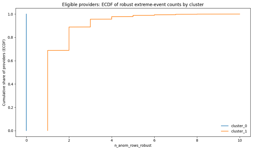
Figure-22: Robust anomaly distribution rate by cluster
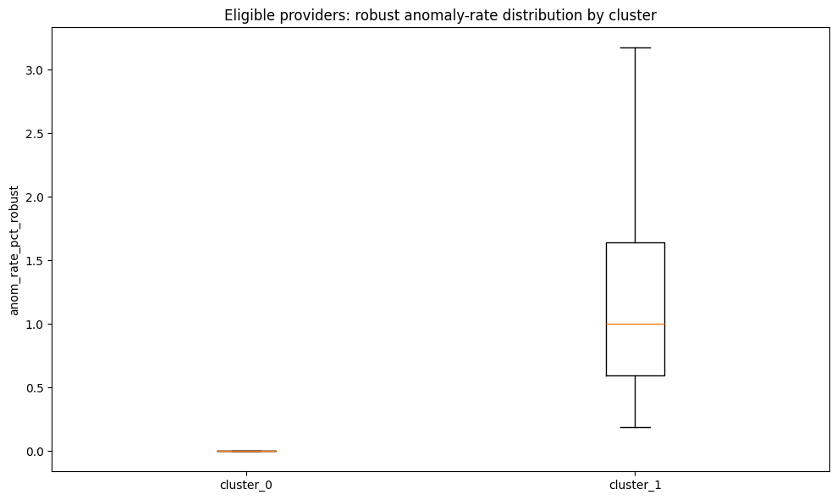
Table-25: Cluster definitions and key feature contrasts
| cluster_label | n_providers | median_n_anom_rows_robust | median_anom_rate_pct_robust | median_p90_log_oe | pct_with_any_shock_event | median_total_services_rob | cluster_definition |
|---|---|---|---|---|---|---|---|
| cluster_0 | 5654 | 0.0 | 0.0 | 0.087 | 0.00 | 16371.0 | Typical cost behavior (no robust tail events) |
| cluster_1 | 1834 | 1.0 | 1.0 | 0.104 | 6.92 | 154184.5 | Elevated anomaly burden (robust tail events present) |
What distance to centroid means
For each provider in a cluster, distance to centroid represents how far that provider sits from the typical provider profile of that cluster in the transformed clustering feature space.
That matters because providers deep inside cluster_1 are not just assigned there. They are strong representatives of the anomaly-burdened profile.
How to read these cluster separation plots
The ECDF plot shows that cluster_0 was essentially clean by construction: providers in this group had 0 robust anomaly rows. In other words, 100% of cluster_0 providers were at zero robust extreme events.
Cluster_1 showed a very different pattern. This group represented providers with recurring robust anomaly burden. Roughly 70% of cluster_1 providers had at least 1 robust anomaly row, and roughly 90% had 2 or fewer robust anomaly rows. A smaller subset had higher repeated-event counts, extending out toward 10 robust anomaly rows.
The anomaly-rate boxplot tells the same story from a rate perspective rather than a count perspective. For cluster_0, the robust anomaly rate was 0%, reflecting no robust tail events among eligible clustered providers. For cluster_1, the robust anomaly rate was meaningfully above zero. Most providers in this group had anomaly rates around roughly 0.5% to 1.6%, with the upper range extending above 3%. In practical terms, some cluster_1 providers had more than 3% of their provider-service rows showing robust over-expected anomaly patterns.
Taken together, the two plots show that the clustering was not simply separating large providers from small providers. It was separating providers with no robust anomaly burden from providers with measurable recurring anomaly burden, using both event counts and event rates.
Explaining the tiers with an interpretable classifier
I did not want the clustering layer to remain a black box. After assigning the labels, I built a logistic regression explainer model designed purely for interpretation rather than production prediction. Its specific goal was to answer: What provider characteristics are strongly associated with membership in the anomaly-burdened cluster? This separation of concerns is vital—the unsupervised clustering created the segmentation, while the supervised logistic model explained it.
I used a deliberately interpretable setup:
- logistic regression,
- selected provider-level covariates,
- explicit reference categories,
- and odds-ratio interpretation.
I also checked coefficient stability using resampling logic rather than taking a single coefficient table at face value.
Table-26: Logistic explainer performance summary
| Class | Precision | Recall | f1-score |
|---|---|---|---|
| cluster_0 | 0.861 | 0.621 | 0.722 |
| cluster_1 | 0.372 | 0.691 | 0.484 |
Figure-23: Confusion matrix
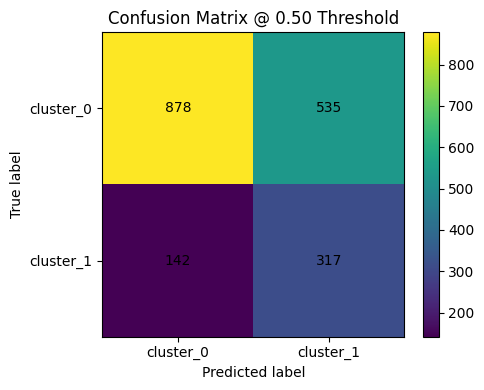
Figure-24: ROC curve
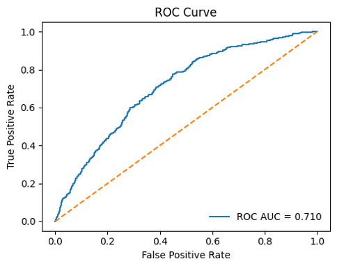
Figure-25: PR curve
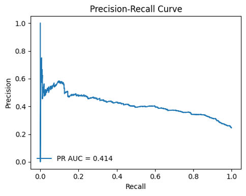
Table-27: Top positive drivers (higher => more likely cluster_1)
| Feature | Coeff (Log Odds) | Odds Ratio |
|---|---|---|
log_total_services_base | 0.746424 | 2.109444 |
ruca_bucket_Rural | 0.166773 | 1.181487 |
p_diabetes | 0.139360 | 1.149538 |
ruca_bucket_Suburban | 0.131840 | 1.140926 |
provider_type_Medical Oncology | 0.114511 | 1.121325 |
p_htn | 0.018032 | 1.018196 |
p_copd | -0.113210 | 0.892963 |
bene_avg_risk_score | -0.114905 | 0.891451 |
p_ckd | -0.207271 | 0.812799 |
p_cancer6 | -0.207449 | 0.812655 |
years_since_enumeration | -0.225805 | 0.797874 |
provider_type_Radiation Oncology | -0.290432 | 0.747940 |
provider_type_Gynecological Oncology | -0.775651 | 0.460404 |
provider_type_Surgical Oncology | -1.564288 | 0.209237 |
Table-28: Top negative drivers (lower => less likely cluster_1)
| Feature | Coeff (Log Odds) | Odds Ratio |
|---|---|---|
provider_type_Surgical Oncology | -1.564288 | 0.209237 |
provider_type_Gynecological Oncology | -0.775651 | 0.460404 |
provider_type_Radiation Oncology | -0.290432 | 0.747940 |
years_since_enumeration | -0.225805 | 0.797874 |
p_cancer6 | -0.207449 | 0.812655 |
p_ckd | -0.207271 | 0.812799 |
bene_avg_risk_score | -0.114905 | 0.891451 |
p_copd | -0.113210 | 0.892963 |
p_htn | 0.018032 | 1.018196 |
provider_type_Medical Oncology | 0.114511 | 1.121325 |
ruca_bucket_Suburban | 0.131840 | 1.140926 |
p_diabetes | 0.139360 | 1.149538 |
ruca_bucket_Rural | 0.166773 | 1.181487 |
log_total_services_base | 0.746424 | 2.109444 |
Baselines | ruca_bucket: Urban; provider_type: Hematology-Oncology
The result was not intended as a production classifier. Instead, it answered a narrower and more useful question: Which provider attributes and contextual signals appear directionally associated with the anomaly-burdened cluster?
That added interpretability and made the clustering outputs easier to discuss with stakeholders.
From notebook to product: The interactive Shiny dashboard
Finally, I wrapped the project into an interactive Shiny for Python application.
The app is not just a demo. It is the interface that turns a notebook-heavy workflow into something navigable, auditable, and operationally usable.
What the app does
The dashboard allows users to explore:
- the benchmarked scored universe,
- row-level anomalies,
- provider-level watchlists,
- provider tiers,
- explainer outputs,
- provider profiles,
- and artifact provenance.
Figure-26: Overview tab
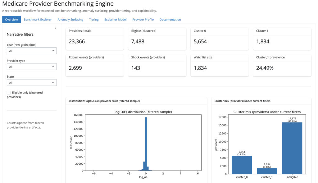
Figure-27: Anomaly surfacing tab
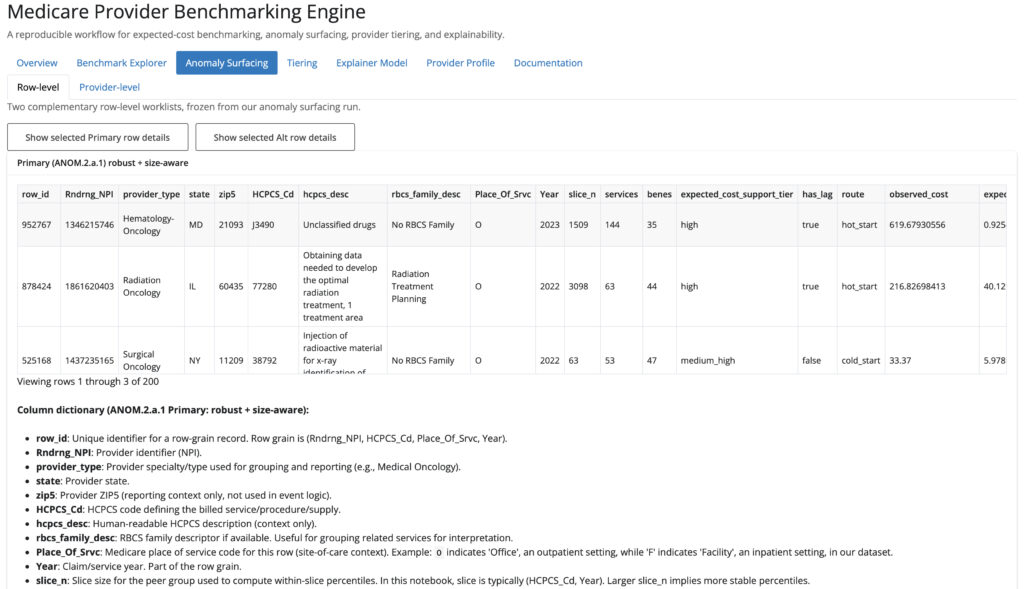
Figure-28: Provider profile tab
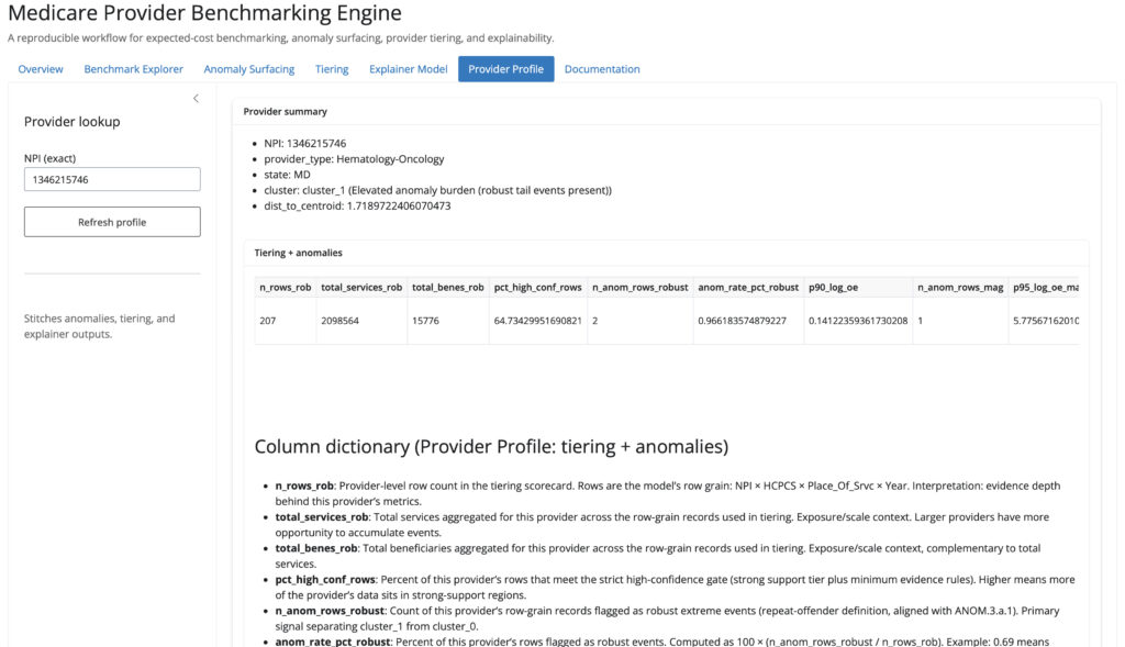
One thing I cared about was provenance. The app surfaces the specific run folders and artifacts being used, so the output remains tied to concrete frozen objects rather than hidden notebook state.
That is a small detail, but it signals something important: this project was built with reproducibility and transparency in mind.
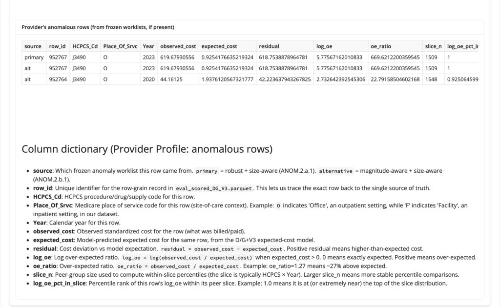
Note: To view a specific provider’s anomalous rows, navigate to the Provider Profile tab, enter the exact provider NPI, click Refresh, and scroll to the Provider’s anomalous rows table. For example, the screenshot below shows the provider profile workflow for NPI 1346215746.
Figure-29: Example view showing ‘Provider’s anomalous rows’ table
What this project demonstrates
This project reflects the kind of data science work I want to do professionally: work that combines statistical modeling, operational judgment, governance, and product thinking. It also shows that I can move from raw administrative healthcare data to a reproducible, explainable decision-support workflow.
It demonstrates my ability to execute across the full data product lifecycle:
- Data Engineering: Extracting and engineering modeling datasets from large, messy, raw administrative healthcare sources.
- Machine Learning & Governance: Comparing models using business-relevant evaluation criteria, segmenting entities with unsupervised learning, and explaining that structure with interpretable supervised models.
- Operational Analytics: Designing guarded scoring systems (rather than raw prediction-only pipelines) and building anomaly surfacing logic that is support-aware and cautious.
- Productization: Freezing and versioning artifacts, and deploying the final engine into a working, interactive application.
Just as importantly, it shows something about how I think:
- I do not stop at “best model wins.”
- I care about how model behavior propagates downstream.
- I treat edge cases seriously.
- I prefer transparent systems over opaque hero numbers.
- I try to design workflows that other people can inspect, rerun, and use.
Final thoughts
The Medicare Provider Benchmarking Engine started as a modeling problem, but it became a broader exercise in building trustworthy analytical infrastructure for decision support.
In real-world settings, the challenge is rarely just prediction. It is deciding how predictions should be translated into action, how much confidence we should place in them, where to be conservative, and how to make the full workflow interpretable.
That is the standard I wanted this project to meet, and that is the kind of data science and analytical product work I will continue building.
If you are working on healthcare fraud detection, provider benchmarking, or machine learning governance, I’d love to connect.
- 📈 Explore the Live App: Medicare Provier Benchmarking Engine
- ⚙️ Review the Code: GitHub Repo (medicare-provider-benchmarking-engine)
References
- Improving Health Care Cost Projections for the Medicare Population: Summary of a Workshop.
- Estimation and Prediction of Hospitalization and Medical Care Costs Using Regression in Machine Learning